Get In Touch
Headquaters.107, Allied Industrial estate, MMC Cross Rd Number 2, Near Khilani school, Mahim, Mumbai, Maharashtra 400016,
Hello@adscult.com
Ph: +1.831.705.5448
Work Inquiries
hello@adscult.com
Ph: +91 976 800 5850

Transaction Square

About

Transaction Square is a Tax, Regulatory, and Business Advisory firm founded by Entrepreneurial Big-4 founders. They provide tax consultancy, M&A, and Business advisory services.

Project Brief

An ever-changing business environment needs a real-time awareness of tax laws, financial trends, and regulations. Transaction Square offers practical solutions that fit clients’ specific needs and empower them to enhance internal processes. They wanted a clutter-free and interactive website that efficiently showcased their values and service offerings.

Problems

Transactions Square’s previous website was cluttered and made it confusing for users to navigate through their website. As they dealt with professional services, they were facing the problem of communicating the benefits of their services to customers effectively. The website also performed poorly in terms of speed and response times.

Challenges

Transaction Square wanted to revamp its website with a clean and minimal UI to convey information to users. However, our team had to deal with various challenges like:

  • Improve site architecture and navigation
  • Make it easier to browse pages without getting lost
  • Create unique animations and designs for each of their services
  • Work with a minimal number of plugins to increase site speed.

Solution

Here’s how AdsCult helped Transaction Square create a user-friendly and clutter-free website:

  • Significantly improved the overall aesthetic and user experience to make the site more engaging
  • Created a high-toned business environment with the right animations
  • Improved website functionality to explore the different services with mobile 
  • Added background photos and a custom color palette for a professional appeal

Tools & tech used

Our Process

  • Strategic Planning
    We recognized the need for a clean and interactive UI from initial inquiry to service selection. Our team focused on creating a seamless user journey to educate users and grab their attention through animated designs.
  • Competitive Research
    Our team underscored the importance of a mobile-responsive design by analyzing leading competitors. We also observed that custom business-oriented backgrounds and color schemes helped create a strong brand identity.
  • User Stories
    By interacting with users, we understood their need for simplicity in information presentation and ease of access to resources. This helped us develop a website architecture to organize information and resources effectively and make them accessible.
  • Regular Interaction with Client
    Regular feedback from the Transaction Square team and prompt design adjustments ensured the website was visually appealing and efficient. Our team was able to tailor the UI to highlight Transaction Square's values in a clean and uncluttered design.

Here’s How We Transformed Transaction Square’s Website

Before After
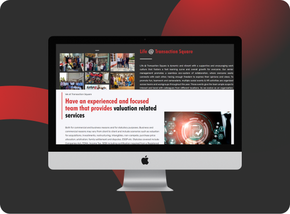
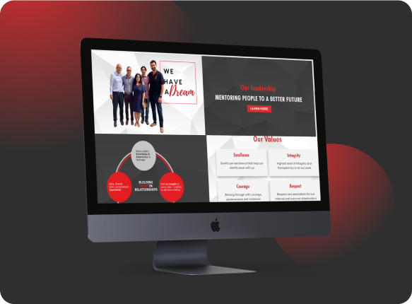
The new design featured bold colors, professional images, and captivating animations, which made the Transaction Square website more appealing and easy to understand by users.

What We Added?

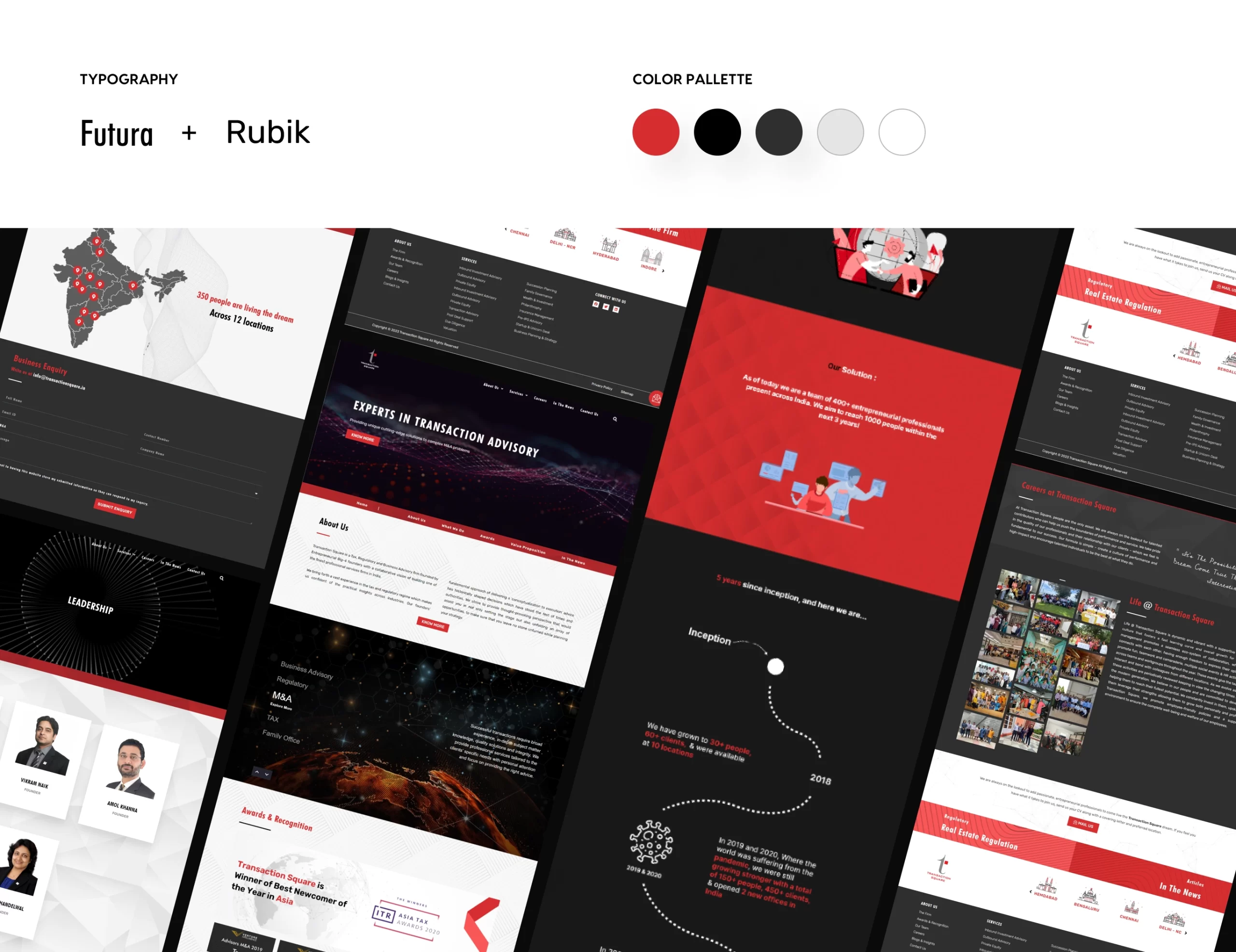
Our team understood the brand proposition and values of Transaction Square to add interactive animations, professional background images, and the right font and color palette to make it easier for users to browse and understand their services.

What We Solved?

We helped Transaction Square design an easy-to-browse website for a pleasant user experience. Our team improved their site architecture, made it mobile-friendly, and designed an engaging user interface.

Go Ahead! Check out Transaction Square’s Website Live

This website stores cookies on your computer. Cookie Policy