Veneto
About
Lorem ipsum dolor sit amet, consectetur adipiscing elit. Ut elit tellus, luctus nec ullamcorper mattis, pulvinar dapibus leo.
Project Brief
Lorem ipsum dolor sit amet, consectetur adipiscing elit. Ut elit tellus, luctus nec ullamcorper mattis, pulvinar dapibus leo.


Problems
Lorem ipsum dolor sit amet, consectetur adipiscing elit. Ut elit tellus, luctus nec ullamcorper mattis, pulvinar dapibus leo.
Challenges
Lorem ipsum dolor sit amet, consectetur adipiscing elit. Ut elit tellus, luctus nec ullamcorper mattis, pulvinar dapibus leo.
Solution
Lorem ipsum dolor sit amet, consectetur adipiscing elit. Ut elit tellus, luctus nec ullamcorper mattis, pulvinar dapibus leo.
Tools & tech used
Our Process
-
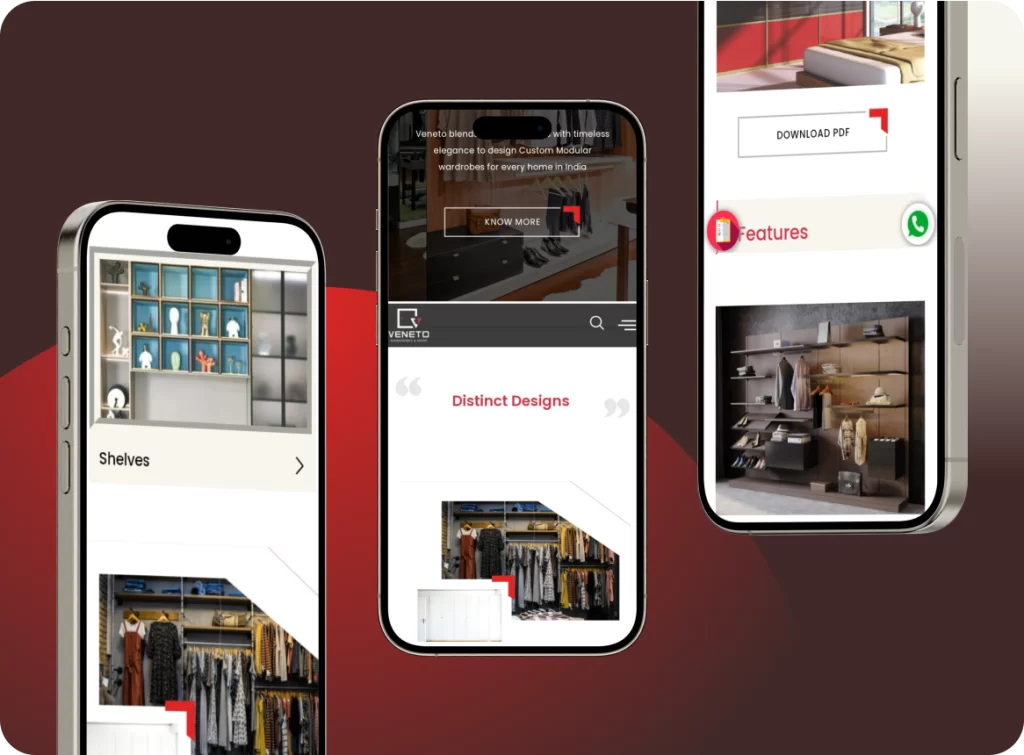
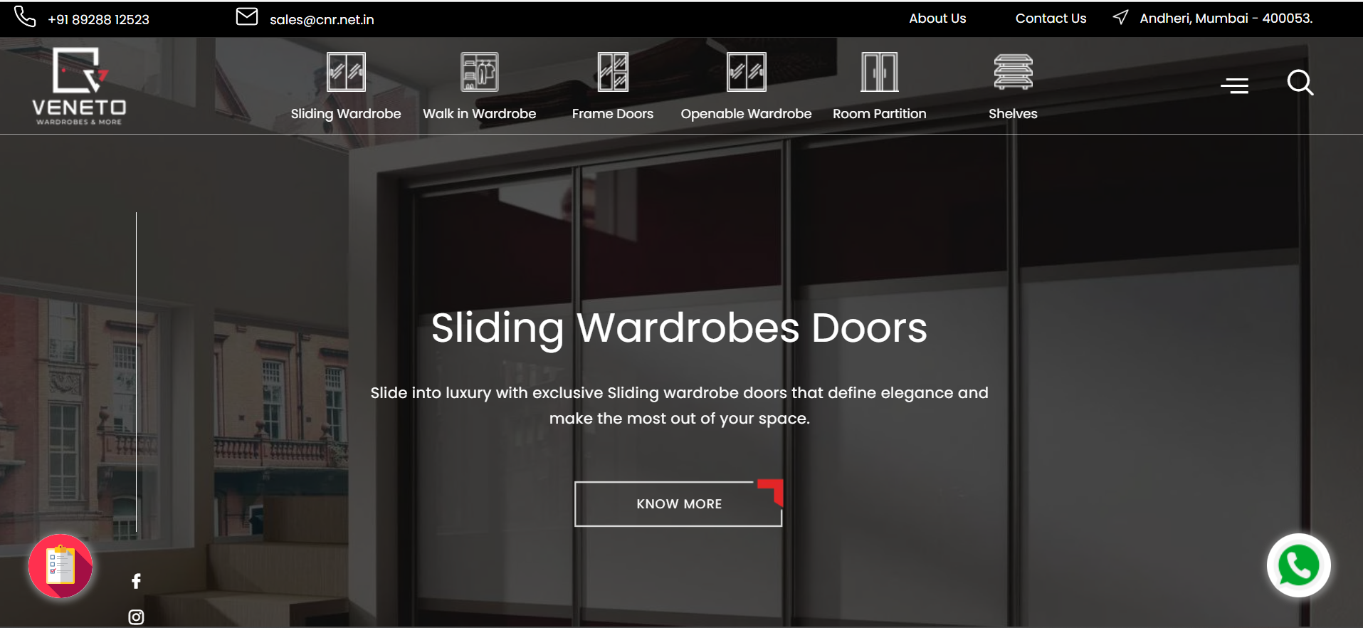
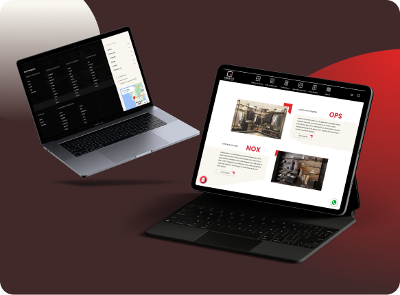
Our team identified the essence of luxury marketing to the customer's online journey and refined user experience. We added a sleek hamburger menu for mobile users and corrected CSS issues to ensure visual and operational fluidity across platforms.
-
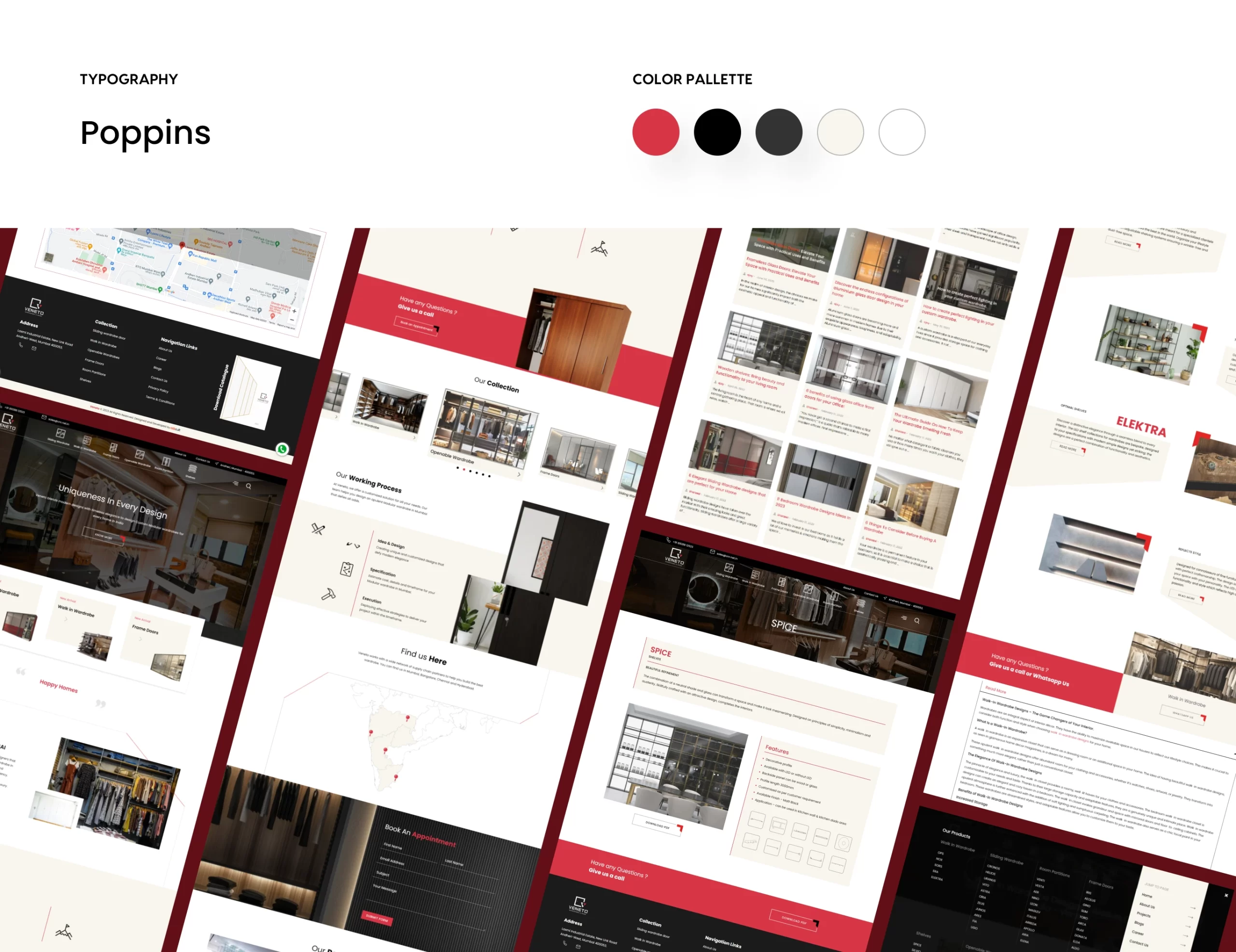
After analyzing the user interface of other premium interior designers to create a sophisticated aesthetic with user-centric design elements. Our team focused on key touchpoints and made it easier for users to navigate across the site.
-
Direct feedback from users provided us with various insights. One was requiring an effortless online experience that offered a personalized touch. To address this, we implemented an interactive pop-up form that served as a digital concierge, making it easier and fun to collect new inquiries.
-
Collaborating with Veneto’s team helped us communicate our insights and promptly change our strategy. This also helped in the smooth migration of data and the addition of new products, which improved efficiency.
Add Your Heading Text Here


Lorem ipsum dolor sit amet, consectetur adipiscing elit. Ut elit tellus, luctus nec ullamcorper mattis, pulvinar dapibus leo.
What We Added
What We Solved
